User Interface
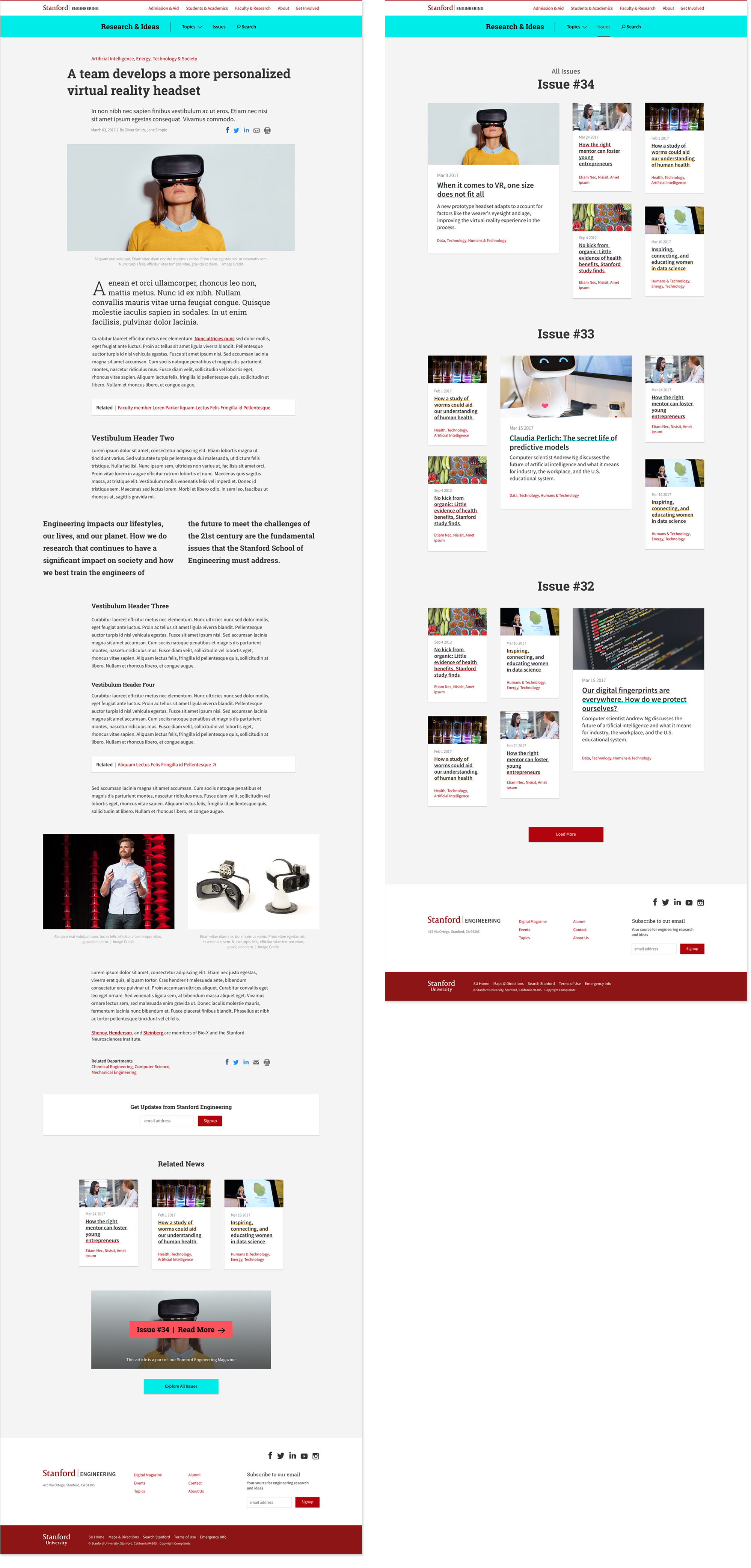
Stanford School of Engineering digital magazine
In January 2018, the Stanford School of Engineering needed a solution for what they began to call it’s digital magazine. As the user interface designer, I was prompted to define a look and feel that reflected the human-centered quality of the Stanford Engineering education, one that celebrates diversity and the drive to discover. With that, (and the weeks of sketching that ensued) I recommended we place emphasis on three bright accent colors—suggesting a sense of play and friendly-ness often left out of this space, particularly in higher-ed; on slightly stout type that too felt a touch friendly; and on simple and clean interface elements—with proportion and scale of those elements in mind—resulting also in a simple and clean viewport.
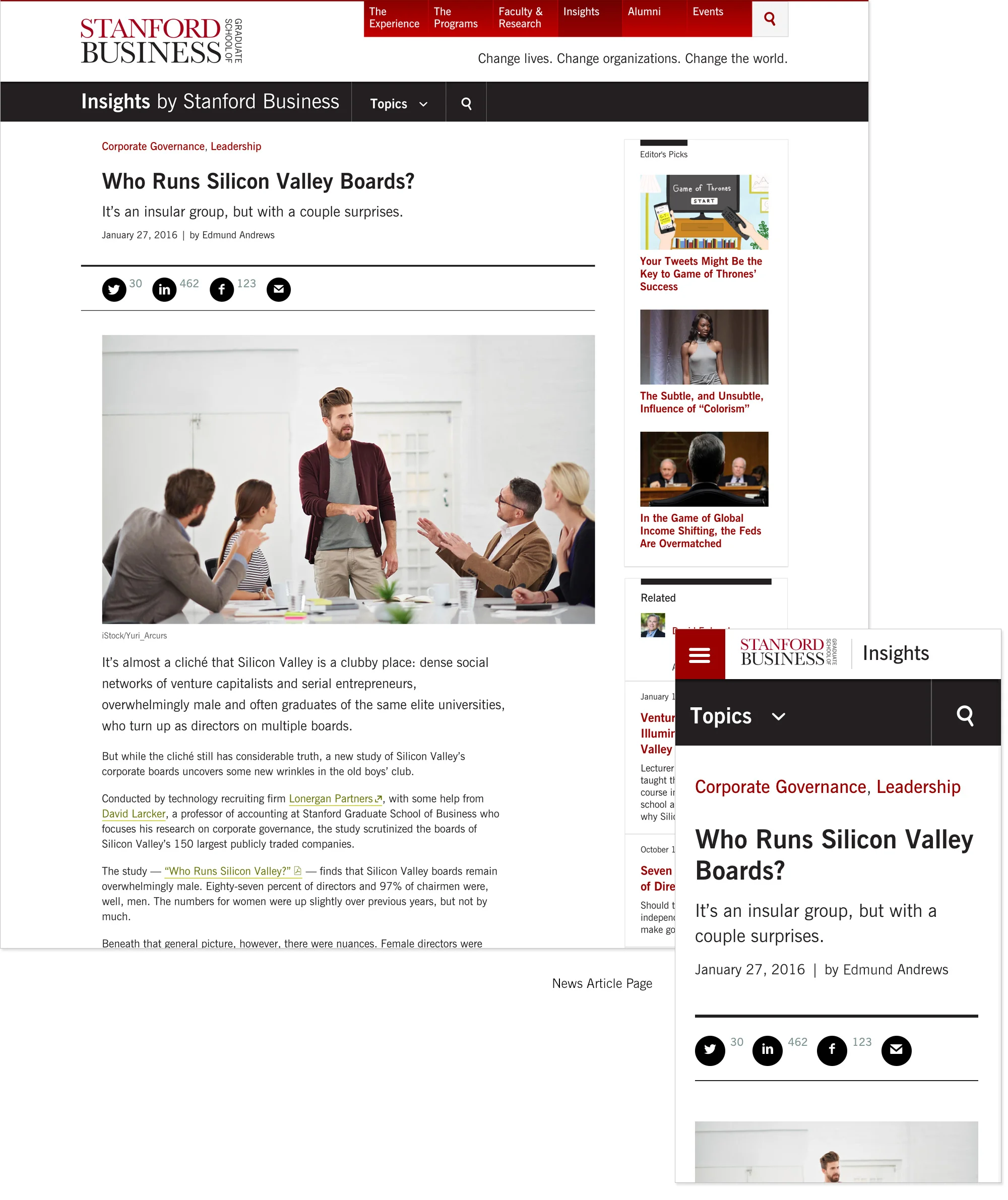
Business Insights, Stanford Graduate School of Business
Another digital magazine, Business Insights—which in 2015 was nominated for a Webby Award. After having custom-designed nearly all other major sections of this site, the team asked that I continue with the look & feel I had established, but to also give this section a touch of it’s own identity apart from the rest of the site. I thought to achieve this by designing layouts that could be entirely this section's own, leaving me free to design the elements within, without degrading the tight visual identity of our design system throughout the rest of the site.
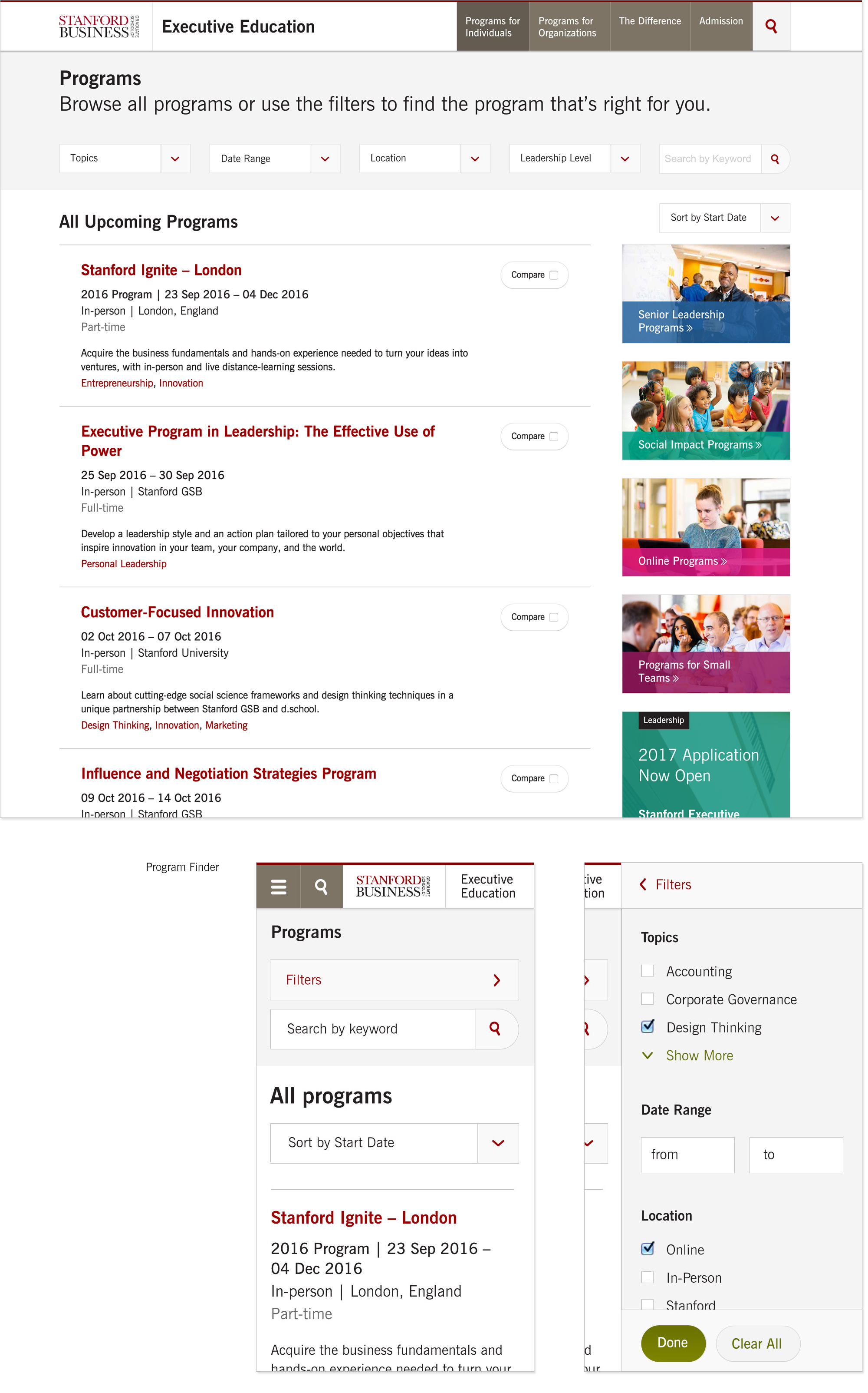
Stanford Executive Education, Program Finder
Create an interface that makes it easy to find programs with a user who might have a two-week window, during a specific month out of the year, inside a certain vertical, with a particular level of expertise and a requirement to get the course approved by their boss. This was designing the Program Finder. I don’t often work in wireframes, unless my team or client have very little idea of their content requirements, and even then, I may only roughly sketch content ideas before going into visual design and look and feel. There are too many aspects of visual design that can tilt the way our eyes perceive visual information. Seventy+ comps paid off for our team on the program finder, which let us test our constraints around adhering to the larger design system from gsb.stanford.edu, brand identity, and most importantly, intuitive usability.
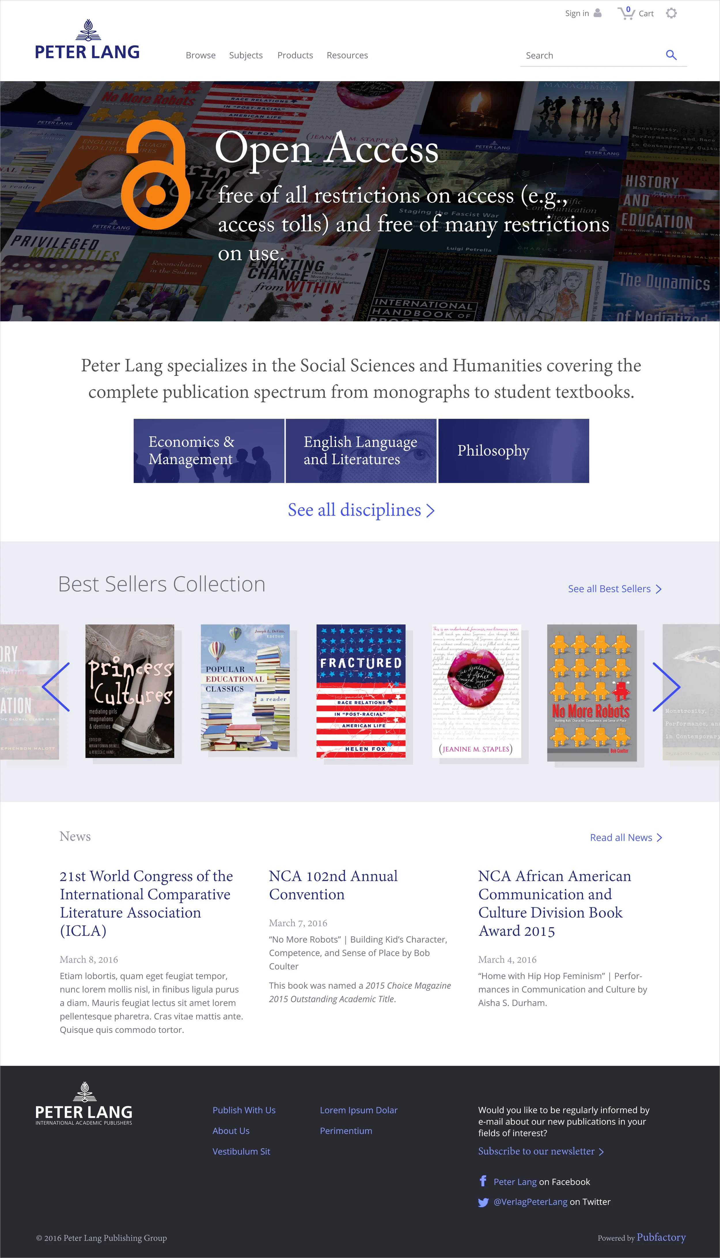
Peter Lang Publishing Group custom homepage
The team at PubFactory brought me into this project to customize the homepage and a number of global elements like the masthead and footer, for Peter Lang Publishing Group. Pubfactory is a CMS that often requires their out-of-the-box platform to be redesigned to conform to the brand requirements of their clients', making the end-product feel more distinctly the “client's own”.

